 matplotlib
# matplotlib
主要用于开发 2d 图表 3d 也可以绘画
绘图流程:
- 创建画布
- 绘制图像
- 显示图像
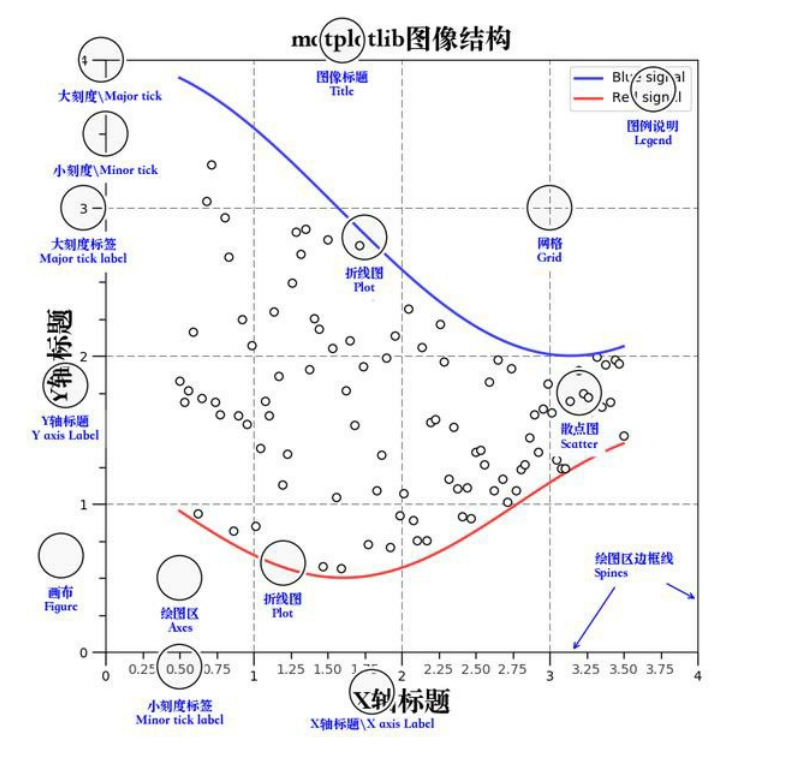
# 三层结构
- 容器层
- canvas
- figure
- axes
- 辅助显示层
- 添加 x 轴 y 轴描述 标题等等
- 图像层
- 绘制什么图像的声明
# 绘制
- plt.figure (figsize=(), dpi=) figsize: 指定图的长宽 dpi: 图像的清晰度 返回 fig 对象 创建画布
- plt.plot (x, y) 绘制图像
- plt.show () 显示图像
import matplotlib.pyplot as plt

#创建画布  figesize为画布尺寸  dpi是像素点
plt.figure(figsize=(20, 8), dpi=100)

#图像绘制
x = [1, 2, 3]
y = [4, 5, 6]
plt.plot(x, y)

#图像展示
plt.show()
1
2
3
4
5
6
7
8
9
10
11
12
2
3
4
5
6
7
8
9
10
11
12
# 保存为图片
#创建画布  figesize为画布尺寸  dpi是像素点
plt.figure(figsize=(20, 8), dpi=100)

#图像绘制
x = [1, 2, 3]
y = [4, 5, 6]
plt.plot(x, y)

#保存图片
plt.savefig("test-mat.png")

#图像展示 show会释放资源 当show调用后plt对象对应的资源也释放了 无法保存为图片
plt.show()
1
2
3
4
5
6
7
8
9
10
11
12
13
2
3
4
5
6
7
8
9
10
11
12
13
# 折线图绘画
import random

x = range(60)
y = [random.uniform(10, 15) for i in x]

plt.rcParams['font.sans-serif'] = ['SimHei'] # 步骤一(替换sans-serif字体)
plt.rcParams['axes.unicode_minus'] = False   # 步骤二(解决坐标轴负数的负号显示问题)

# 创建画布
plt.figure(figsize=(15, 8), dpi=300)

# 绘制
plt.plot(x, y)


# 添加 x,y轴刻度
y_ticks = range(40)  # 需要提供一个列表
plt.yticks(y_ticks[::5])  # 通过yticks方法赋予属性

x_ticks_label = ["11点{}分".format(i) for i in x]
plt.xticks(x[::5], x_ticks_label[::5])   #第一个参数必须为数字不能为字符串数组

#添加网格
plt.grid(True, linestyle="-",alpha=1)  #linestyle为线样式 -为折线 --为虚线   alpha为线的透明度

#添加描述
plt.xlabel("时间")
plt.ylabel("温度")
plt.title("一小时温度变化图")


plt.show()
1
2
3
4
5
6
7
8
9
10
11
12
13
14
15
16
17
18
19
20
21
22
23
24
25
26
27
28
29
30
31
32
2
3
4
5
6
7
8
9
10
11
12
13
14
15
16
17
18
19
20
21
22
23
24
25
26
27
28
29
30
31
32
# 中文显示问题解决
plt.rcParams['font.sans-serif'] = ['SimHei']
plt.rcParams['axes.unicode_minus'] = False
1
2
2
# 多次 plot 和图例
x = range(60)
y_beijing = [random.uniform(10, 15) for i in x]
y_shanghai = [random.uniform(10, 25) for i in x]
plt.rcParams['font.sans-serif'] = ['SimHei']
plt.rcParams['axes.unicode_minus'] = False
plt.figure(figsize=(15, 8), dpi=300)
plt.plot(x, y_beijing, label="北京")
plt.plot(x, y_shanghai, label="上海",color='r' , linestyle='-') # 第二次绘制 如果想显示图例必须赋予laber图例名 color 为线条颜色 linestyle为线条样式
#具体值参照以下图
y_ticks = range(40)
plt.yticks(y_ticks[::5])
x_ticks_label = ["11点{}分".format(i) for i in x]
plt.xticks(x[::5], x_ticks_label[::5])
plt.grid(True, linestyle="-", alpha=1)
plt.xlabel("时间")
plt.ylabel("温度")
plt.title("一小时温度变化图")
# 显示图例
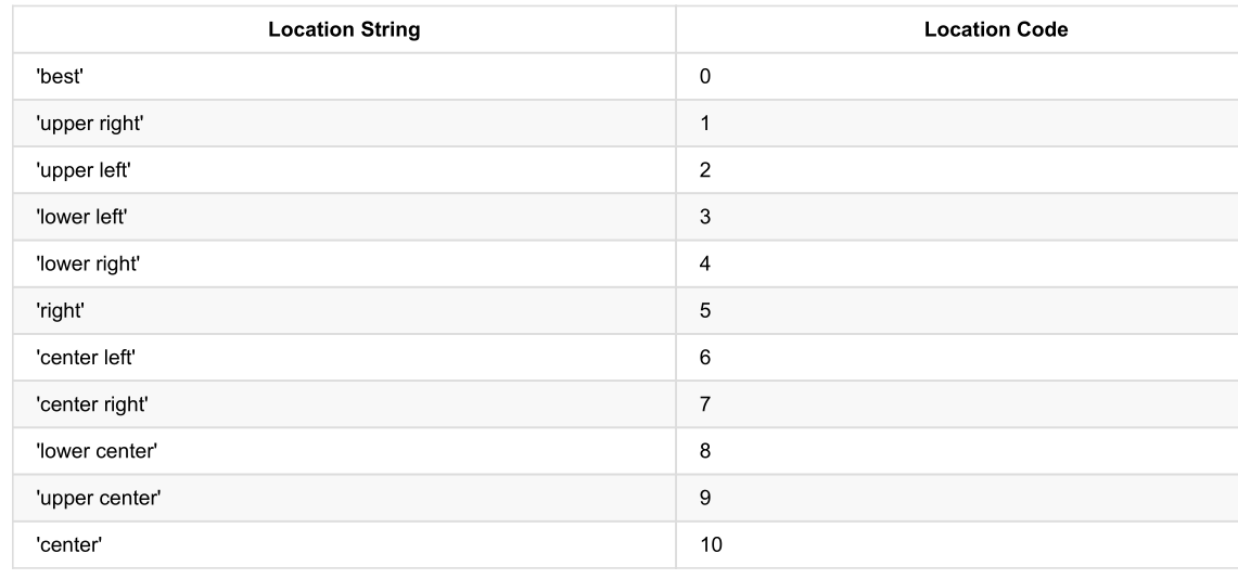
plt.legend(loc=3) #loc为图例位置 值参照以下图
plt.show()
1
2
3
4
5
6
7
8
9
10
11
12
13
14
15
16
17
18
19
20
21
22
23
24
25
26
27
28
29
30
31
32
33
34
2
3
4
5
6
7
8
9
10
11
12
13
14
15
16
17
18
19
20
21
22
23
24
25
26
27
28
29
30
31
32
33
34
# 图例显示位置
# 绘制折线图
plt.plot(x, y_shanghai, label="上海")
# 使用多次plot可以画多个折线
plt.plot(x, y_beijing, color='r', linestyle='--', label="北京")
# 显示图例
plt.legend(loc="best")
1
2
3
4
5
6
2
3
4
5
6
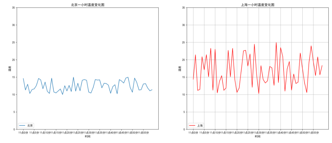
# 多个坐标系显示
x = range(60)
y_beijing = [random.uniform(10, 15) for i in x]
y_shanghai = [random.uniform(10, 25) for i in x]

plt.rcParams['font.sans-serif'] = ['SimHei']
plt.rcParams['axes.unicode_minus'] = False


# 使用subplot绘制多个坐标系
# plt.figure(figsize=(15, 8), dpi=300)
fig, axes = plt.subplots(nrows=1, ncols=2, figsize=(20, 8), dpi=300)   #nrows 几行    ncols几列  并且大部分需要转换为set_xxxx方法


# plt.plot(x, y_beijing, label="北京")
# plt.plot(x, y_shanghai, label="上海",color='r' , linestyle='-')
axes[0].plot(x, y_beijing, label="北京")
axes[1].plot(x, y_shanghai, label="上海", color='r', linestyle='-')


y_ticks = range(40)
# plt.yticks(y_ticks[::5])
axes[0].set_yticks(y_ticks[::5])
axes[1].set_yticks(y_ticks[::5])

x_ticks_label = ["11点{}分".format(i) for i in x]
# plt.xticks(x[::5], x_ticks_label[::5])
axes[0].set_xticks(x[::5])
axes[0].set_xticklabels(x_ticks_label[::5])
axes[1].set_xticks(x[::5])
axes[1].set_xticklabels(x_ticks_label[::5])


plt.grid(True, linestyle="-", alpha=1)

# plt.xlabel("时间")
# plt.ylabel("温度")
# plt.title("一小时温度变化图")
axes[0].set_xlabel("时间")
axes[0].set_ylabel("温度")
axes[0].set_title("北京一小时温度变化图")
axes[1].set_xlabel("时间")
axes[1].set_ylabel("温度")
axes[1].set_title("上海一小时温度变化图")


# plt.legend(loc=3)
axes[0].legend(loc=3)
axes[1].legend(loc=3)

plt.show()
1
2
3
4
5
6
7
8
9
10
11
12
13
14
15
16
17
18
19
20
21
22
23
24
25
26
27
28
29
30
31
32
33
34
35
36
37
38
39
40
41
42
43
44
45
46
47
48
49
50
51
52
2
3
4
5
6
7
8
9
10
11
12
13
14
15
16
17
18
19
20
21
22
23
24
25
26
27
28
29
30
31
32
33
34
35
36
37
38
39
40
41
42
43
44
45
46
47
48
49
50
51
52
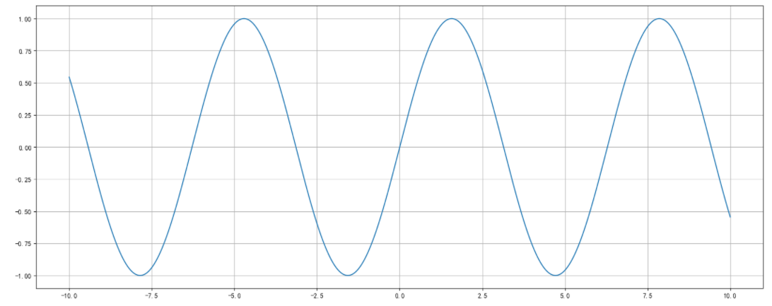
# 数学折线图 figure
import numpy as np

# 从-10 到 10 的1000个数据
x = np.linspace(-10,10,1000)
y = np.sin(x)

plt.figure(figsize=(20,8),dpi=100)

plt.plot(x,y)

plt.grid()

plt.show
1
2
3
4
5
6
7
8
9
10
11
12
13
2
3
4
5
6
7
8
9
10
11
12
13
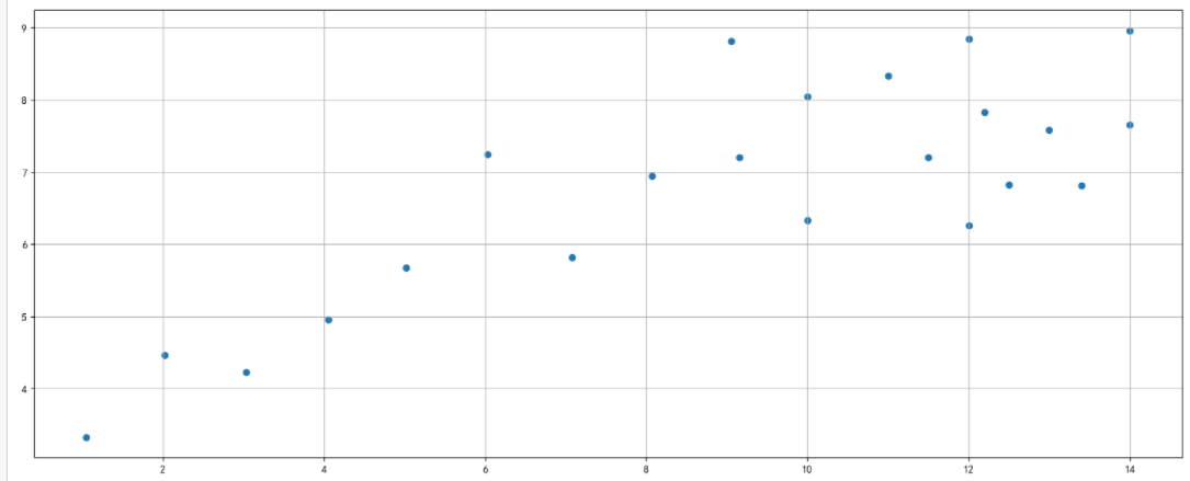
# 散点图 scatter
x = [10.0, 8.07, 13.0, 9.05, 11.0, 14.0, 13.4, 10.0, 14.0, 12.5, 9.15,
     11.5, 3.03, 12.2, 2.02, 1.05, 4.05, 6.03, 12.0, 12.0, 7.08, 5.02]
y = [8.04, 6.95, 7.58, 8.81, 8.33, 7.66, 6.81, 6.33, 8.96, 6.82, 7.20,
     7.20, 4.23, 7.83, 4.47, 3.33, 4.96, 7.24, 6.26, 8.84, 5.82, 5.68]

plt.figure(figsize=(20, 8), dpi=100)

#散点图
plt.scatter(x, y)

plt.grid()

plt.show
1
2
3
4
5
6
7
8
9
10
11
12
13
2
3
4
5
6
7
8
9
10
11
12
13
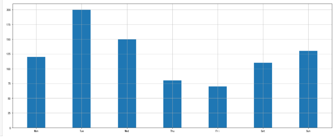
# 柱状图 bar
x =['Mon', 'Tue', 'Wed', 'Thu', 'Fri', 'Sat', 'Sun']
y =[120, 200, 150, 80, 70, 110, 130]

plt.figure(figsize=(20, 8), dpi=100)

#柱状图
plt.bar(x, y,width=0.4)  #width为柱状图宽度

plt.grid()

plt.show
1
2
3
4
5
6
7
8
9
10
11
2
3
4
5
6
7
8
9
10
11
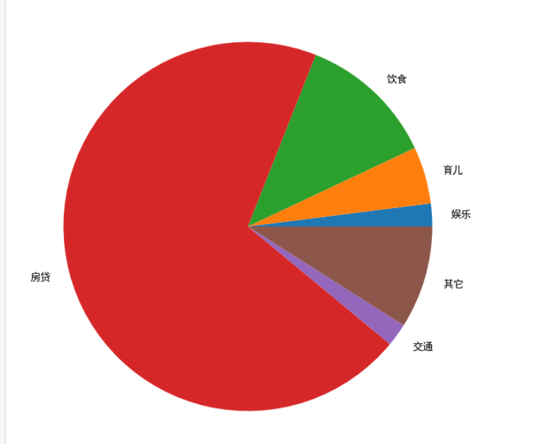
# 饼图 pie
x =[2,5,12,70,2,9]
labels = ['娱乐','育儿','饮食','房贷','交通','其它']
plt.figure(figsize=(20, 8), dpi=100)

#饼图
plt.pie(x,labels=labels)  #x为数据   labels为lengt的名称

plt.grid()

plt.show
1
2
3
4
5
6
7
8
9
10
2
3
4
5
6
7
8
9
10
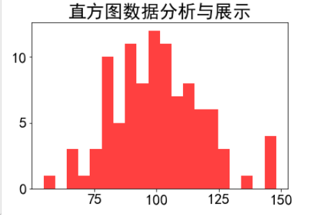
# 直方图 hist
plt.rcParams['font.family']='SimHei'
plt.rcParams['font.size']=20

# 直方图
mu = 100
sigma = 20
x = np.random.normal(100,20,100) # 均值和标准差

plt.hist(x,bins=20,color='red',histtype='stepfilled',alpha=0.75)
plt.title('直方图数据分析与展示')
plt.show()
1
2
3
4
5
6
7
8
9
10
11
2
3
4
5
6
7
8
9
10
11
编辑 (opens new window)
上次更新: 2023/12/06, 01:31:48